New Year, New Website
We are happy to introduce our new and improved website!
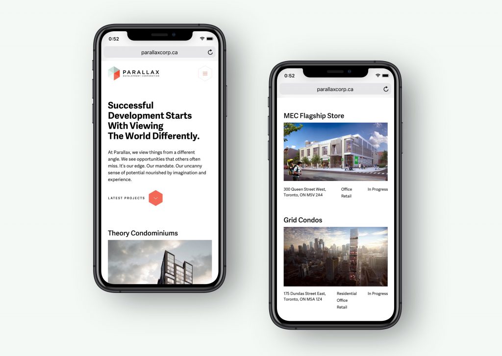
Our new website represents our growing business and reflects an accurate vision of who we are as individuals, a brand and a Canadian developer. The site tells our story through our work, our values and our good name.
Designed and built by 52 Pick-up Inc., this site took a minimalist approach that allows our projects and properties to take front row. This offers a simple and direct way to showcase what we do.

Breaking away from a traditional grid layout, the site gives the perception of flexibility – something we pride ourselves on as a company, through our years of experience working in multiple asset classes.
The design incorporates elements built from our existing brand. Diagonal lines across the site were introduced as a derivative of the hexagon that forms our Parallax logo. These lines will guide you as you navigate through the pages.
The new website will give our users a comprehensive experience through an interactive platform as it reflects our shifting focus as we continue to evolve and grow our business.
Stay tuned. Great things are happening at Parallax!